7 Common Web UX Mistakes That Can Damage Your Business
The primary goal of the website in your business is to give your users the best possible experience. But, there are few elements that can damage your website’s credibility and the user experience, which will lead to the loss in business.
As we know, User Experience (UX) design is the key process that acts as a bridge between your business goals and users. Therefore, you need to provide an optimal environment for your users to keep them engaged.
To save your business from damage and to assure you design the best quality website, here I’ve mentioned seven most common mistakes and what can be the best possible solution for it.
#1 Personalizing Your Website Over Functionality or ViceVersa
You might have heard a lot in recent times that personalizing your website with creative graphics, some authentic pictures or a few interactive designs. But, your website should have a perfect balance between functionality and usability. Your personalizing of the website should not override the functionality.
Yes, users want creativity, but they even want to sail through your site easily.
Similarly, just having a lot of functionalities for your website won’t work. If your site is just all about functionality, users might get bore and go to some other sites. Only functionality with no creativity or excitement will make your business easily forgettable. Your website should be creative, unique and with needed functionalities. This way you can keep your business stand out of the crowd and achieve a brand name.
#2 Disregarding Responsive Design
Responsive design is not just a trend but is the most important aspect of owning a successful design in the present as well as upcoming years. I’ve still encountered some of the websites that have not fully adapted to resize as per the device screens. And that is why responsive design is still important.
As more and more people are now accessing the website via mobiles rather than desktops, it is essential to make your website look perfect in every screen size. Responsive design will ensure that your site quickly resizes as per the device. With that, it will allow your users to have a seamless UX experience even after switching to different devices. You need to compromise a large number of an audience if your website is not responsive. Redesign your site if it is not responsive and enhance your user’s experience.
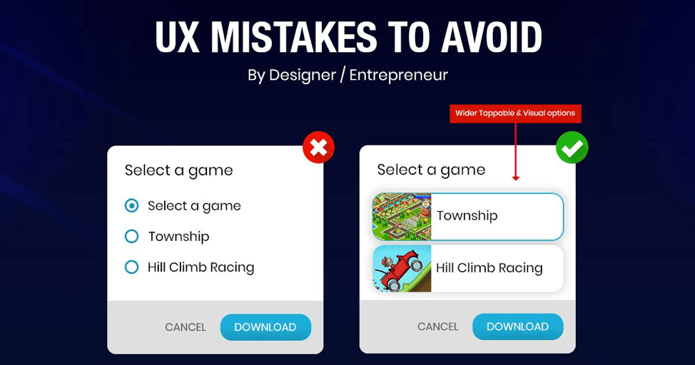
#3 Long Boring Forms
Have you ever filled 20 fields just to buy a single thing or get an e-book? What do you think, how many of us would go ahead to fill this form? Almost no one, right?
This is the point, make the forming process fast and simple. If you keep such long forms, you will observe a high bounce rate on your site. Creating too many steps will keep your users frustrated and thus increase the bounce rate. Henceforth try to keep your forms as simple as possible.
It has been observed that when the form fields were reduced from four to three, the conversion rate was improved by almost half. Thus having a long-form will disengage the users.
#4 Messy Website Design
This is the most common mistake made by almost every business. Having a messy website design can lead to the total failure of the site. Many websites just have a scrollbar on every page of their site. Or some of them have just made it messy by keeping too many images or more content.
Remember, utilize modern design standards for your website and highlight the white space available with some decent background. If your website design includes some incomprehensible content and too many images, users would not know where to pay attention, as they will get distracted.
The point to take note here is highlighting the important parts of your site like the CTA. Try to get the focus of your user by images and text.
#5 Designing Your Own Site
There might come some issues when you design site on your own and you don’t go for any research on trends going on in the market, who are the competitors, targeted audience and much more. When you work this blindly, it becomes more difficult to meet the expectation.
What you need and what your audience need is totally opposite, therefore you need to design a website keeping users perspective in mind.
#6 Thin & Light Fonts
These days for no reason thin and light fonts are in trend. Just because of the advancement of screen technology, a lot of designers are using this trend. However, thin typefaces cause usability problems and will affect the UX.
Thin & light fonts will even cause the readability issue, the goal of text on the website is to be legible. To achieve a perfect contrast and readability, designers should get a perfect combination of size & color. The best thing here to test your fonts on different devices. This can give you a better idea of setting the fonts on your site.
#7 Too Many Pop-Ups Notifications
Yes, pop-ups are a big deal, it is proven to be a great lead generation tool. But when there is an innumerable pop-up in your site it can make your users frustrated.
Just imagine a situation, where users face is filled up with popups rather than the information they are looking for. What do you think, will they come back ever again?
So, when you keep a pop-up notification on your site, make sure you don’t frustrate your users.
Conclusion
By making such mistakes in UX designs, you can totally ruin your business. Do you remember how much does it cost to create an app? Or the resources you spent on it. Besides that, having such mistakes in your UX can fail your business.
Once you focus on the above-mentioned mistakes, you can keep your audience engaged and increase your ROI. UX really matters to keep more and more users coming to your site.
So, did you like our blog? Or We missed out on anything. Let us know in the comment section below.