Android ViewPager And ViewPagerIndicator Example
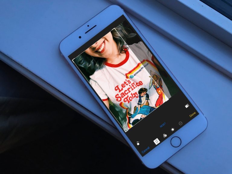
A friend of mine came to me and said I want to make a Payment Transaction app. We’ve talked for a while about the project and clarify some points regarding development point of view. After some days he came up with designs, I made some changes to the designs and start developing the app. In the designs, there’s an App Intro screen with a ViewPager, a ViewPagerIndicator, and a beautiful animation when swiping through pages. I personally really like the App Intro design and thought why not write an article on it.

You see the demo right..? Now, let’s start making it in Android. This is a very simple app and I did not include any kind of dependencies so we’re not gonna see the build. gradle file or Manifest file.
Android App Coding
The design is very basic first, at the top we have a ViewPager, then the ViewPagerIndicator dots, and last at the bottom there’s a Button. Below is the activity_main.xml file.
<?xml version="1.0" encoding="utf-8"?>
<RelativeLayout xmlns:android="http://schemas.android.com/apk/res/android"
    xmlns:tools="http://schemas.android.com/tools"
    android:layout_width="match_parent"
    android:layout_height="match_parent"
    android:background="@drawable/intro_background"
    tools:context=".MainActivity">

    <android.support.v4.view.ViewPager
        android:id="@+id/myViewPager"
        android:layout_width="match_parent"
        android:layout_height="match_parent"
        android:layout_above="@+id/viewPagerIndicatorIconsLayout"
        android:layout_marginBottom="10dp" />


    <LinearLayout
        android:id="@+id/viewPagerIndicatorIconsLayout"
        android:layout_width="wrap_content"
        android:layout_height="wrap_content"
        android:layout_above="@+id/getStartedButton"
        android:layout_centerHorizontal="true"
        android:layout_marginBottom="20dp"
        android:orientation="horizontal">

        <ImageView
            android:id="@+id/firstDotImageView"
            android:layout_width="wrap_content"
            android:layout_height="wrap_content"
            android:contentDescription="@null"
            android:src="@drawable/current_position_icon" />

        <ImageView
            android:id="@+id/secondDotImageView"
            android:layout_width="wrap_content"
            android:layout_height="wrap_content"
            android:layout_marginStart="7dp"
            android:contentDescription="@null"
            android:src="@drawable/disable_position_icon" />

        <ImageView
            android:id="@+id/thirdDotImageView"
            android:layout_width="wrap_content"
            android:layout_height="wrap_content"
            android:layout_marginStart="7dp"
            android:contentDescription="@null"
            android:src="@drawable/disable_position_icon" />

    </LinearLayout>

    <Button
        android:id="@+id/getStartedButton"
        android:layout_width="match_parent"
        android:layout_height="wrap_content"
        android:layout_alignParentBottom="true"
        android:layout_marginBottom="15dp"
        android:layout_marginEnd="20dp"
        android:layout_marginStart="20dp"
        android:background="@drawable/button_drawable"
        android:text="@string/get_started"
        android:textAllCaps="false"
        android:textColor="@color/colorSubText" />

</RelativeLayout>
Main Activity
class MainActivity : AppCompatActivity() {

    companion object {
        private const val MIN_SCALE = 0.65f
        private const val MIN_ALPHA = 0.3f
    }

    private lateinit var pagerAdapterView: MyPagerAdapter
    private val uiHelper = UiHelper()

    override fun onCreate(savedInstanceState: Bundle?) {
        super.onCreate(savedInstanceState)
        requestWindowFeature(Window.FEATURE_NO_TITLE)
        window.setFlags(WindowManager.LayoutParams.FLAG_FULLSCREEN, WindowManager.LayoutParams.FLAG_FULLSCREEN)
        setContentView(R.layout.activity_main)
        pagerAdapterView = MyPagerAdapter(supportFragmentManager)
        addPagerFragments()
        myViewPager.adapter = pagerAdapterView
        myViewPager.setPageTransformer(true, this::zoomOutTransformation)
        getStartedButton.typeface = uiHelper.getTypeFace(TypeFaceEnum.BUTTON_TEXT, this)
        myViewPager.addOnPageChangeListener(ViewPagerListener(this::onPageSelected))
    }

    private fun onPageSelected(position: Int) {
        when (position) {
            0 -> {
                firstDotImageView.setImageResource(R.drawable.current_position_icon)
                secondDotImageView.setImageResource(R.drawable.disable_position_icon)
                thirdDotImageView.setImageResource(R.drawable.disable_position_icon)
            }
            1 -> {
                firstDotImageView.setImageResource(R.drawable.disable_position_icon)
                secondDotImageView.setImageResource(R.drawable.current_position_icon)
                thirdDotImageView.setImageResource(R.drawable.disable_position_icon)
            }
            2 -> {
                firstDotImageView.setImageResource(R.drawable.disable_position_icon)
                secondDotImageView.setImageResource(R.drawable.disable_position_icon)
                thirdDotImageView.setImageResource(R.drawable.current_position_icon)
            }
        }
    }

    private fun addPagerFragments() {
        pagerAdapterView.addFragments(IntroFirstFragment())
        pagerAdapterView.addFragments(IntroSecondFragment())
        pagerAdapterView.addFragments(IntroThirdFragment())
    }

    private fun zoomOutTransformation(page: View, position: Float) {
        when {
            position < -1 ->
                page.alpha = 0f
            position <= 1 -> {
                page.scaleX = Math.max(MIN_SCALE, 1 - Math.abs(position))
                page.scaleY = Math.max(MIN_SCALE, 1 - Math.abs(position))
                page.alpha = Math.max(MIN_ALPHA, 1 - Math.abs(position))
            }
            else -> page.alpha = 0f
        }
    }
}
Below is the MainActivity explanation.
- onPageSelected: This method called every time when the ViewPager changes its page position and with that, we’re changing the ViewPagerIndicator dot icons.
- addPagerFragments: In this function, we’re adding the pages of ViewPager means all the Fragment.
- zoomOutTransformation: This method helps the ViewPager to animate the view or zoom out when swiping through the pages.
- onCreate: In this method, we’re setting a FULL_SCREEN flag, creating a ViewPagerAdapter, setting page transformation for zoom out, and finally adding a ViewPager page change listener.
MyPagerAdapter
class MyPagerAdapter(fm: FragmentManager) : FragmentPagerAdapter(fm) {

    private var fragmentList: MutableList<Fragment> = ArrayList()

    override fun getItem(position: Int) = fragmentList[position]

    override fun getCount() = fragmentList.size

    fun addFragments(fragment: Fragment) = fragmentList.add(fragment)
}
The PagerAdapter class is the base class providing the adapter to populates pages inside of a ViewPager. It simply adds the fragments to the collection and represents each page as a Fragment.
IntroFirstFragment
Before start making the fragment UI. I wanna show you how the first-fragment design looks like.
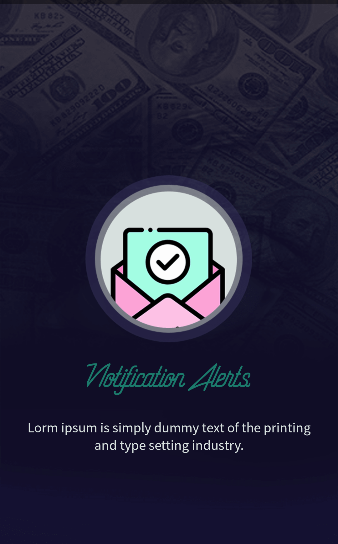
The UI is very basic, we have an ImageView, the image title text, and a description text. Below is the intro_first_fragment.xml file.
<?xml version="1.0" encoding="utf-8"?>
<RelativeLayout xmlns:android="http://schemas.android.com/apk/res/android"
    xmlns:tools="http://schemas.android.com/tools"
    android:layout_width="match_parent"
    android:layout_height="match_parent"
    tools:context=".fragments.IntroFirstFragment">

    <ImageView
        android:id="@+id/notificationAlertsImageView"
        android:layout_width="200dp"
        android:layout_height="180dp"
        android:layout_centerInParent="true"
        android:contentDescription="@null"
        android:src="@drawable/notification_alerts_icon" />

    <TextView
        android:id="@+id/notificationAlertsTextView"
        android:layout_width="wrap_content"
        android:layout_height="wrap_content"
        android:layout_below="@+id/notificationAlertsImageView"
        android:layout_centerHorizontal="true"
        android:layout_marginTop="15dp"
        android:text="@string/notification_alerts"
        android:textColor="@color/colorTitleText"
        android:textSize="45sp" />

    <TextView
        android:id="@+id/notificationAlertsSubTitleTextView"
        android:layout_width="match_parent"
        android:layout_height="wrap_content"
        android:layout_below="@+id/notificationAlertsTextView"
        android:layout_marginEnd="20dp"
        android:layout_marginStart="20dp"
        android:layout_marginTop="25dp"
        android:gravity="center"
        android:text="@string/lorem_ipsum"
        android:textColor="@color/colorSubText"
        android:textSize="15sp" />

</RelativeLayout>
IntroFirstFragment Kotlin Class
class IntroFirstFragment : Fragment() {

    private val uiHelper = UiHelper()

    override fun onCreateView(inflater: LayoutInflater, container: ViewGroup?, savedInstanceState: Bundle?): View? {
        val view = layoutInflater.inflate(R.layout.intro_first_fragment, container, false)
        view.findViewById<TextView>(R.id.notificationAlertsTextView).typeface = uiHelper.getTypeFace(TypeFaceEnum.HEADING_TYPEFACE, activity!!)
        view.findViewById<TextView>(R.id.notificationAlertsSubTitleTextView).typeface = uiHelper.getTypeFace(TypeFaceEnum.SEMI_TITLE_TYPEFACE, activity!!)
        return view
    }

}
In this fragment, we’re simply finding its views and setting Typeface to these views.
SecondIntroFragment
Below is the second-fragment design.

In this fragment UI, we have the same ImageView, title, and subtitle texts. The following shows the intro_second_fragment.xml file.
<?xml version="1.0" encoding="utf-8"?>
<RelativeLayout xmlns:android="http://schemas.android.com/apk/res/android"
    xmlns:tools="http://schemas.android.com/tools"
    android:layout_width="match_parent"
    android:layout_height="match_parent"
    tools:context=".fragments.IntroSecondFragment">

    <ImageView
        android:id="@+id/easyPaymentImageView"
        android:layout_width="200dp"
        android:layout_height="180dp"
        android:layout_centerInParent="true"
        android:contentDescription="@null"
        android:src="@drawable/easy_payment_icon" />

    <TextView
        android:id="@+id/easyPaymentTextView"
        android:layout_width="wrap_content"
        android:layout_height="wrap_content"
        android:layout_below="@+id/easyPaymentImageView"
        android:layout_centerHorizontal="true"
        android:layout_marginTop="15dp"
        android:text="@string/easy_payments"
        android:textColor="@color/colorTitleText"
        android:textSize="45sp" />

    <TextView
        android:id="@+id/easyPaymentSubTitleTextView"
        android:layout_width="match_parent"
        android:layout_height="wrap_content"
        android:layout_below="@+id/easyPaymentTextView"
        android:layout_marginEnd="20dp"
        android:layout_marginStart="20dp"
        android:layout_marginTop="25dp"
        android:gravity="center"
        android:text="@string/lorem_ipsum"
        android:textColor="@color/colorSubText"
        android:textSize="15sp" />

</RelativeLayout>
SecondIntroFragment Kotlin Class
class IntroSecondFragment : Fragment() {

    private val uiHelper = UiHelper()

    override fun onCreateView(inflater: LayoutInflater, container: ViewGroup?, savedInstanceState: Bundle?): View? {
        val view = layoutInflater.inflate(R.layout.intro_second_fragment, container, false)
        view.findViewById<TextView>(R.id.easyPaymentTextView).typeface = uiHelper.getTypeFace(TypeFaceEnum.HEADING_TYPEFACE, activity!!)
        view.findViewById<TextView>(R.id.easyPaymentSubTitleTextView).typeface = uiHelper.getTypeFace(TypeFaceEnum.SEMI_TITLE_TYPEFACE, activity!!)
        return view
    }
}
In here we’re doing the same work which we have done in our previous fragment like finding and setting the Typeface of TextViews.
ThirdIntroFragment
The following shows the third-fragment UI screen.

Below is the intro_third_fragment.xml file.
<?xml version="1.0" encoding="utf-8"?>
<RelativeLayout xmlns:android="http://schemas.android.com/apk/res/android"
    xmlns:tools="http://schemas.android.com/tools"
    android:layout_width="match_parent"
    android:layout_height="match_parent"
    tools:context=".fragments.IntroThirdFragment">

    <ImageView
        android:id="@+id/moneyRecordImageView"
        android:layout_width="200dp"
        android:layout_height="180dp"
        android:layout_centerInParent="true"
        android:contentDescription="@null"
        android:src="@drawable/money_record_icon" />

    <TextView
        android:id="@+id/moneyRecordTextView"
        android:layout_width="wrap_content"
        android:layout_height="wrap_content"
        android:layout_below="@+id/moneyRecordImageView"
        android:layout_centerHorizontal="true"
        android:layout_marginTop="15dp"
        android:text="@string/money_records"
        android:textColor="@color/colorTitleText"
        android:textSize="45sp" />

    <TextView
        android:id="@+id/moneyRecordSubTitleTextView"
        android:layout_width="match_parent"
        android:layout_height="wrap_content"
        android:layout_below="@+id/moneyRecordTextView"
        android:layout_marginEnd="20dp"
        android:layout_marginStart="20dp"
        android:layout_marginTop="25dp"
        android:gravity="center"
        android:text="@string/lorem_ipsum"
        android:textColor="@color/colorSubText"
        android:textSize="15sp" />

</RelativeLayout>
ThirdIntroFragment Kotlin Class
class IntroThirdFragment : Fragment() {

    private val uiHelper = UiHelper()

    override fun onCreateView(inflater: LayoutInflater, container: ViewGroup?, savedInstanceState: Bundle?): View? {
        val view = layoutInflater.inflate(R.layout.intro_third_fragment, container, false)
        view.findViewById<TextView>(R.id.moneyRecordTextView).typeface = uiHelper.getTypeFace(TypeFaceEnum.HEADING_TYPEFACE, activity!!)
        view.findViewById<TextView>(R.id.moneyRecordSubTitleTextView).typeface = uiHelper.getTypeFace(TypeFaceEnum.SEMI_TITLE_TYPEFACE, activity!!)
        return view
    }
}
UiHelper
class UiHelper {

    /**
     * check which type is requested as an enum parameter and return the actual typeface.
     *
     * @param typeFaceEnum enum type like maybe RisingStar_Regular.otf
     * @param activity required to create assets.
     * @return returns a typeface which is requested by as an enum parameter.
     */

    fun getTypeFace(typeFaceEnum: TypeFaceEnum, activity: Activity): Typeface {
        return Typeface.createFromAsset(activity.assets, typeFaceEnum.getName())
    }
}
This is the helper class which provides the Typeface with the requested params. The createFromAsset is the static method creates a new typeface from the specified data.
TypeFaceEnum
enum class TypeFaceEnum(val value: String) {
    HEADING_TYPEFACE("fonts/RisingStar_Regular.otf"),
    SEMI_TITLE_TYPEFACE("fonts/SourceSansPro-Regular.otf"),
    BUTTON_TEXT("fonts/Ubuntu-M.ttf");

    fun getName() = value
}
One last thing we need to complete this app is the ViewPagerListener class.
ViewPagerListener
class ViewPagerListener(private val closure: (Int) -> Unit) : ViewPager.OnPageChangeListener {

    override fun onPageScrollStateChanged(p0: Int) {
    }

    override fun onPageScrolled(p0: Int, p1: Float, p2: Int) {
    }

    override fun onPageSelected(position: Int) = closure(position)
}
This class implements the ViewPager.OnPageChangeListener class which response to changing the state of the selected page.
Alright, guys, that was all from this article. If you want the source code, images and icons of the above app get it from GitHub. If you’ve any queries regarding this article please do comment below.
Thank you for being here and keep reading…