Data Visualizing from CSV Format to Chart using Python
In this article, we will download a data set from an online resource and create a working visualization of that data. As we have discussed in the previous article, the internet is being bombarded by lots of data each second. An incredible amount and variety of data can be found online. The ability to analyze data allows you to discover the patterns and connections.
We will access and visualize the data store in CSV format. We will use Python’s CSV module to process weather data. We will analyze the high and low temperatures over the period in two different locations. Then we will use matplotlib to generate a chart.
By the end of this article, you’ll be able to work with different datasets and build complex visualizations. It is essential to be able to access and visualize online data which contains a wide variety of real-world datasets.
The CSV File Format
CSV stands for Comma Separated Values. As the name suggests, it is a kind of file in which values are separated by commas.
It is one of the simpler ways to store the data in a textual format as a series of comma separated values. The resulting file is called a CSV file.
For example, below given is a line of weather data on which we are going to work in this article.
2014-1-6,62,43,52,18,7,-1,56,33,9,30.3,30.2,. . ., 195
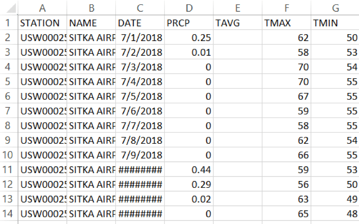
This is the weather data. We will start with a small dataset. It is CSV formatted data Stika, Alaska. You can download datasets from https://www.wunderground.com. This is how your CSV file of data will look like:
The first line is called the header.
Parsing the CSV File Headers
We can easily parse the values and extract the required information using the Python’s csv module. Let’s start by analyzing the first line of the file which contains the headers used for data.
1. Create a python file nameweather_data.py
2. Write the following statement to import the CSV module:
import csv
3. Download the data file from here.
4. Open the file using Python’s open function and print the headers:
filename = ‘sitka_weather_07-2018_simple.csv’
with open(filename) as f:
	reader = csv.reader(f)  #line 1
	header_row = next(reader)  #line 2
	print(header_row)	#line 3
After importing the CSV module, we store the name of the file in the variable filename. We then open the file using the open function and store the result file object in f.
Next, on line 1, we have called the reader function of the CSV module and passed the file object f to it as an argument. This function creates a reader object associated with that file.
The CSV module contains a next() function which returns the next line in the file. next() function accepts a reader object as an argument. So, it returns the next line of the file with which reader object is associated. We only need to call the next() function once to get the first line of the file which contains header normally. So, the header is stored in the variableheader_row. The next line, just prints the header row.
Here is the output of the above code snippet:
['STATION', 'NAME', 'DATE', 'AWND', 'PGTM', 'PRCP', 'SNWD', 'TAVG', 'TMAX', 'TMIN', 'WDF2', 'WDF5', 'WSF2', 'WSF5', 'WT01', 'WT02', 'WT04', 'WT05', 'WT08']
reader processes the first line of comma-separated values and stores each as an item in the list. For example, TMAX denotes maximum temperature for that day.
Printing the Headers with their positions
We usually print header with their position in the list, to make it easier to understand the file header data.
import csv

filename = 'sitka_weather_2018_full.csv'

with open(filename) as f:
    reader = csv.reader(f)
    header_row = next(reader)
    for index,column_header in enumerate(header_row):
        print(index, column_header)
Output:
0 STATION
1 NAME
2 DATE
3 AWND
4 PGTM
5 PRCP
6 SNWD
7 TAVG
8 TMAX
9 TMIN
10 WDF2
11 WDF5
12 WSF2
13 WSF5
14 WT01
15 WT02
16 WT04
17 WT05
18 WT08
We have used the enumerate() function on the list to get the index of each item in the list and as well the value. NOTE: We have removed the print(header_row) line to get a more detailed version of data.
Here we can see that the date and respective max temperature are stored in column 2 and 8 respectively. Let’s extract these.
Extracting and Reading Data
Now that we know which columns of data we need, let’s read in some of that data. First, we’ll read in the high temperature for each day:
highs = []
    for row in reader:
        highs.append(row[8])  #appending high temperatures
    print(highs)
We make an empty list named highs. Then, we iterate through each row in the reader and keep appending the high temperature which is available on index 8 to the list. The reader object continues from where it left in the CSV file and automatically returns a new line on its current position. Then we print the list. It looks like below:
['48', '48', '46', '42', '46', '44', '39', '36', '34', '28', '34', '41', '53', '63', '60', '54', '47', '46', '42', '45', '43', '41', '41', '40', … , ]
As we can see that list returned is in the form of strings. Now, we convert these strings to number using int() so that they can be read by matplotlib.
for row in reader:
	if row[8] == ‘’:
		continue 	# There are some empty strings which can’t be converted to int
high = int(row[8]) #Convert to int
highs.append(high)  #appending high temperatures
Now our data is ready to for plotting.
[48, 48, 46, 42, 46, 44, 39, 36, 34, 28, 34, 41, 53, 63, 60, 54, 47, 46, 42, 45, 43, 41, 41, 40, 40, 41, 39, 40, 40, 39, 36, 35, 35, 34, 42, 41, 39, 42, 39, 37, 37, 40, 43, 41, 40, 38, 36, 37, 39, 39, 38, 41, 42, 41, 39, 38, 42, 39, 40,. . ., ]
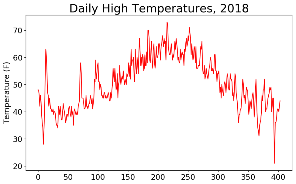
Plotting Data in Temperature Chart using Matplotlib
To visualize the temperature data, we will first create a plot of daily high temperatures using matplotlib.
So, here’s the Code.
import csv
from matplotlib import pyplot as plt
filename = 'sitka_weather_2018_full.csv'

with open(filename) as f:
    reader = csv.reader(f)
    header_row = next(reader)
    highs = []
    for row in reader:
        if row[8]=='':
            continue
        high = int(row[8],10)
        highs.append(high)  #appending high temperatures

    #Plot Data
    fig = plt.figure(dpi = 128, figsize = (10,6))
    plt.plot(highs, c = 'red') #Line 1
    #Format Plot
    plt.title("Daily High Temperatures, 2018", fontsize = 24)
    plt.xlabel('',fontsize = 16)
    plt.ylabel("Temperature (F)", fontsize = 16)
    plt.tick_params(axis = 'both', which = 'major' , labelsize = 16)
    plt.show()
Running the Above Code, you’ll get this.
Thank you for reading. I hope It will be helpful. Comment If you find any difficulty. I’ll love to solve your problem.
Here’re some more Articles, you might be interested:
— Data Visualization in Python Using Simple Line Chart